Trend Charts offer the ability to record and view how your point values change over time. The default “All Points View” provides a link for each point that displays the selected, single point chart.
But, you might ask “Is there a way to have a chart display multiple points on the same chart?“
Yes! The steps below will show you how to create a custom chart of multiple values and save your chart settings in your account.
Create Custom Trend Chart Steps:
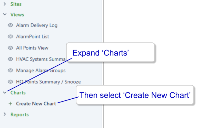
1. From the tree along the left margin, expand the ‘Charts’ node, and then select ‘Create New Chart’.
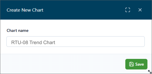
2. Give your new Chart a descriptive name,… then click ‘Save’.
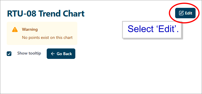
3. You will see a message that your new Chart does not yet have any points to plot.
Click the ‘Edit’ button to begin configuring your Chart.
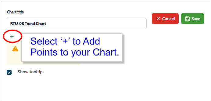
4. In the Edit mode, you can click the ‘+’ to add lines from any Points in your Site.
In the Edit mode you can also change the name of your custom Chart.
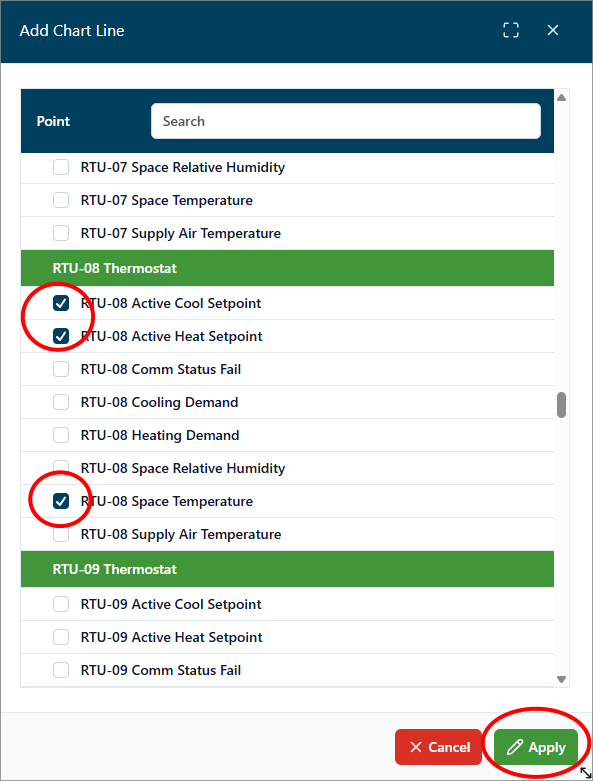
5. Each line on your Chart will display the values for one point. You may add as many lines as your wish.
Select one or more points from the drop-down list that appears.
Then click ‘Apply’.
6. The Points added will be saved for this Chart under your User Account.
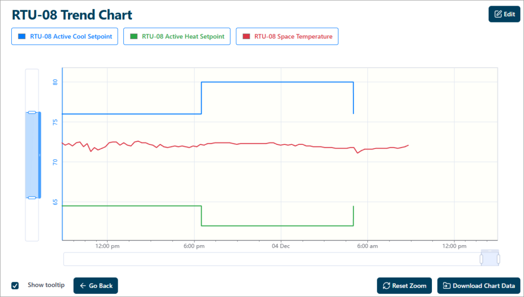
The names of the points you have selected will be shown in the legend at top of the Chart.
You can scroll left and right to see different time periods. And the bars along each axis allow you to zoom in/out on the Chart as well.
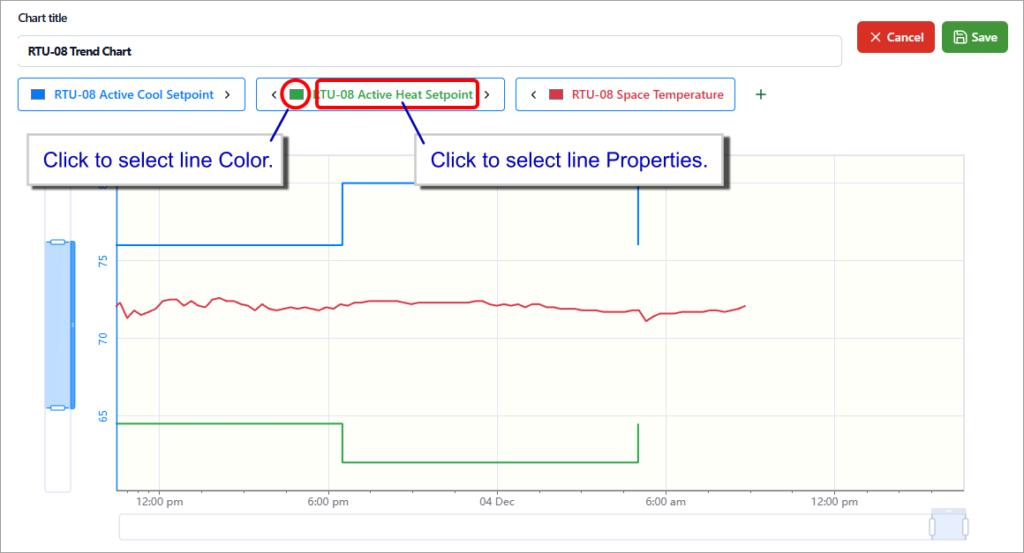
7. Returning to the Edit mode, you can customize your Chart by adjusting the properties for each Line such as Color and Scale.
When the Chart is set to your liking, Click the ‘Save’ link at the upper right.